Tips For Creating An Online Portfolio
It is essential for commercial photographers and other artists today to have an online space to present their work. An online portfolio needs some basic but key parts: a selection of images and work, a description of the type and style of work you do, your contact information, and optional rates and prices. There are many other elements that need to be decided upon to make your portfolio stand out and capture the viewer’s attention.
Explore the ideas below to get you started and spark your creativity for a picturesque design that potential customers and fans will admire.
Focus on Instagram
Thousands of artists and photographers, graphic designers and illustrators, and other creatives use Instagram to display their work and grow a following. Unfortunately, links can’t be inserted into an individual post’s caption as of yet, but a link to your portfolio can go in your bio.
Building a strong Instagram presence takes a lot of work, outreach, and community-building, but it’s worth it when you can draw in fans and customers that would otherwise never discover you.
Link to a simple portfolio with your essential information and more details about your work and reference the “link in bio” in your posts. Instagram posts can be easily shared to your other profiles on Facebook and Twitter.
Select the Right Theme
Pick a site theme, color scheme, and even font that suit your overall tone. You may enjoy a particular color combination or look, but it might not suit your work.
Create an Eye-Catching Gallery
When designing the gallery to display your work, remember ease of use. Viewers should be able to easily scroll or click through successive images. The BACK button should not be necessary.
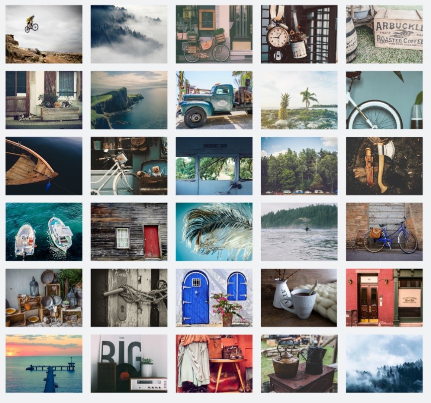
Also, if your gallery thumbnails are presented in a block formation, think about how they look together as a whole. Consider the color balancing, shapes, textures, and styles, and how these present together. Rearrange them to create an attractive and cohesive whole.
Feature high quality photos to view yet not the entire full-sized files to prevent illegal access. If you do multiple types of work, create clear, separate headings for ease of browsing and comprehension.
Link to Professional Online Photo Printing Services
Share a link to your favorite boutique printing shop like Print Partner so potential buyers can learn about options for printing and the wide variety of mediums to choose from, like wrapped canvas, metal, and acrylic. It will allow them to better envision what your work might look like made into a gallery-quality print in their home.
Keep It Sleek and Simple
There are unnecessary elements that can be added to a site that slows down its load time and increases levels of annoyance. Avoid pop-ups, auto-playing videos or sound, and too much media on every page. A portfolio that takes forever to load with too much media and even advertisements will chase a large percentage of people with short patience away.
Include Narrative Details
If appropriate, many people enjoy reading inspiration and stories behind pieces of art. Along with the basic specs, consider telling brief stories about the pieces. Be sure to include this after the vital information for those who just want the bare bones.
Be Careful with Experimental Designs
A unique design that is eye-catching and uses unique web design techniques that go beyond the pale can be a fantastic touch, but it is risky! Designs that aren’t intuitive can make your site confusing when presenting your work is the goal. Have trusted friends try out your design and watch them while they navigate to see if anything isn’t clear or easy to use.


