
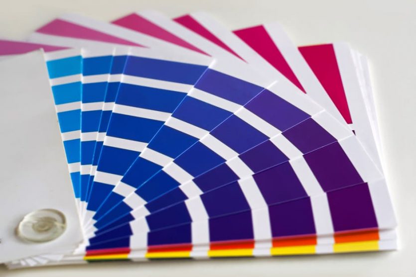
5 Quick Tips to Select a Color Palette for Your Decor
Do you know your color palette? If not, then let us help you out! Choosing a color palette is not easy, the very first thing you need to do is discover your color preferences. Visualize your living space and be specific.
Once you do that, consider the following tips before you take on the walls.
Follow Your Style
Decorate honestly, and everyone will appreciate it because you have added your element. It doesn’t matter if others decorate their house the same way or not, they will appreciate the fact you have the guts to show your taste.
The fact is, you can make anything look good if you want to. Just mind the basics like your architecture, Color wheel, respecting the formal areas, and choosing a color scheme as the largest part of your home décor.
Repeat the Palette
The basic rule of working with a streamlined color is you pick a palette and repeat it. Doing so helps you to transit between rooms. Yes, you can repeat the same color family, but do it differently. Yes, keep the color family but repeat it differently for every space.
For instance, you can add different upholstery for a striking (yet controlled) effect.
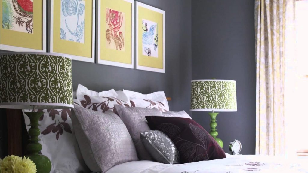
Use a Dash of White
You can use White to freshen everything up. You don’t need to be a proponent of painting everything white to appreciate how it upstate and modernizes any living space. White is timeless and gives your décor a contemporary personality.
Moreover, it introduces a youthful spirit. Don’t worry; you don’t need to paint every wall white. Just introduce it in anything including a lamp, side table, or décor pieces. Add white accents to help the color balance. Remember it when you select blinds Canada.
Color and Pattern
When you dial a pattern, you need to dial down the color to achieve a cool effect. Yes, you can start with something bold, but you need to stick with the same pattern and color. Don’t break the rhythm by using a different color or pattern midway.
If you are using muted color as your base, don’t break the pattern by introducing vibrant colors. You need to stay loyal to the look you want to achieve. Therefore, once you pick a calm color, stick with quiet hues but don’t use dreary or diluted version of the base color.
Avoid overusing something. There are many different colors of cream. If used properly, they can be eccentric but use it too much, and they create a sad and outdated vibe.
Experiment with Percentages
You can get more use out of a small group of colors if you change in between them. Yes, push accent colors to the foreground. Walls are not the only thing you need to create a statement. You can do it with curtains, lamps, seating options, etc.
Walls are only a part of your design. So just because you have painted them with a specific color, it doesn’t mean they dominate everything else. You still need to consider your furniture, décor, and other elements.